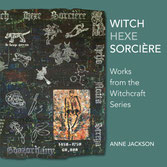
I recently produced a book associated with my current long-term project, "The Witchcraft Series". This experience has made me realise that writing about my own work, and publishing it, has become an important aspect of my practice. I am taking the opportunity of my submission for the 62 Group exhibition CTRL/Shift to expand into a further area of publishing by starting this blog on my website.
(My book, "Witch, Hexe, Sorciere: Works from the Witchcraft Series", is available to purchase, price £12.00 + postage & packing. Please e mail me for details.)
INTRODUCTION
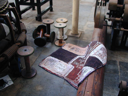
Over the course of my career, I have experimented a number of times with making site-specific or installation work. The piece pictured here, "Discard" (1999), was my first attempt, and was made for a group show in an old weaving mill at Uffculme in Devon. I was quite pleased with this piece, but further attempts in this direction were less successful. Combining the "realness" of real objects with my own textile approach somehow never worked.
The brief for CTRL/Shift is to move in new directions in our practice, ao I decided to make another installation piece, using the actual object as my starting point, and analysing carefully how I could make a textile element that would work successfully as part of an overall composition. I have documented this process through writing and photography, and am now posting the result as a blog on my website. This is something I have never done before, and is providing a real, and useful, learning curve.
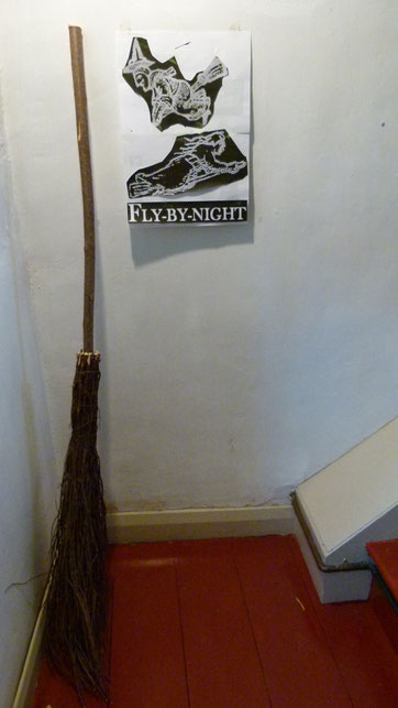
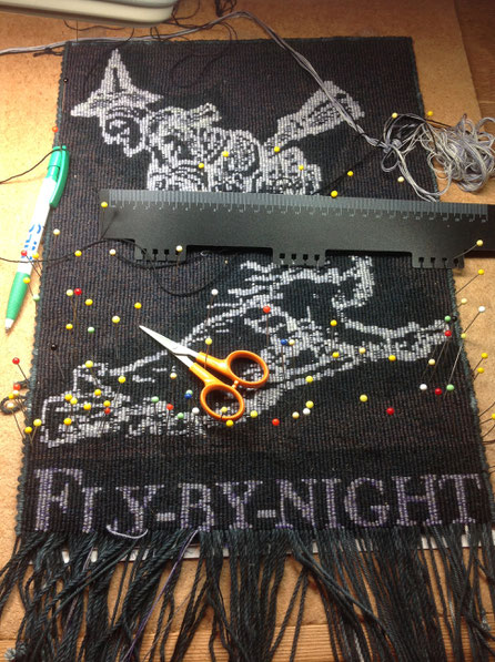
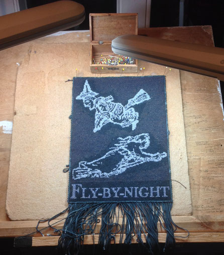
"FLY-BY-NIGHT"
THINKING & MAKING (JOURNAL)
11th October 2017
Moving into installation. How can I integrate "found objects" into my "made" work? There's something about the materiality of the pre-existing object, created for an entirely different purpose, that seems difficult for me to integrate. On this occasion, I am experimenting with starting from the basis of the broomstick. I have stuck the cartoon of the tapestry, not yet made, up on the wall beside the broomstick, so I can consider the relationships between them from the very beginning, before I've even fully planned the tapestry.
I haven't yet decided how to make the colours work between the "found object" and the "made object". The tapestry, with its explicit imagery and text, and its crafted quality, will communicate in one way, while the broomstick has a particular authority derived from its pre-existing materiality,and will communicate in another.
The theme I'm working with is the idea, documented from the earliest written sources, that witches could fly, on forked sticks or broomsticks. I coupled this with an early dictionary definition of a "fly-by-night" as a witch. The tapestry colours will be dictated by this content, but I want them also to balance with the broomstick.
The dark/night shades I will use should also echo the wood tones of the broom & handle.
12th October
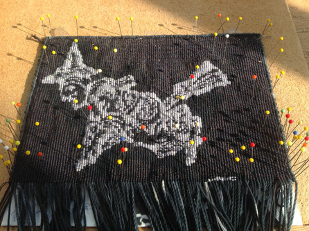
I'm now thinking of making two versions of the tapestry, one very dark, where the images are barely visible, as if glimpsed in the night sky, and one where they're lighter and more clearly visible & graphic, especially as they are originally historic woodcut images, appropriated from early illustrated witch-hunting pamphlets. I am thinking about which approach might work better with the broomstick. (I can consider making two versions as the tapestries are small and relatively quick for me to make, only about a month each....)
15th October
My latest thinking is to go for the graphic, higher-contrast version. I think the pale and dark colours will hold up better against the real-world materiality of the broomstick.
23rd October
I opted for fairly soft, mottled grey tones for the figures, both because, to my eyes, things seen in dim, nocturnal light always appear less sharp, and because the softness reflects the aged quality of the ink & paper of the woodcut images. The softness is also maybe more "organic" alongside the bark, & twiggy qualities,of the broomstick.
24th October
Moving towards installation as opposed to fully wall-based work allows me to expand on one of the themes in "The Witchcraft Series", I realise. It could illustrate how the ideas and concepts surrounding the figure of "the witch" intertwine with "real-world thinking". Juxtaposing the pre-existing found object with the wholly constructed object, made as a result of exploring these ideas and beliefs, sets up these kinds of resonances.
I am also beginning to see how important writing directly about my own practice is becoming. I am in the midst of a one-woman exhibition of my work at The Museum in the Park, Stroud, entitled "Certaine Wytches: Fear, Myth & Magic". It has involved a lot of writing: the above-mentioned book, a catalogue, the texts on this website, and a series of wall-panels providing context and historical source-material. I notice that visitors are as interested in reading the panels as they are in looking at the work. The writing has become a central part of my practice, and may well remain so.

3rd November
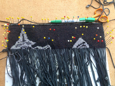
I am experimenting with very subtle colour-shifts in the background around the figures in the tapestry. It's a bit monotonous to do, but should give a bit of richness while keeping a sense of darkness and space around the images.
I am thinking ahead about what to do about the text at the bottom. As with the images, I want it to have presence when alongside the "real-world" bulk and weight of the broomstick. Text incorporated into the fabric and imagery of the composition is characteristic of my practice; how will it work with the new element leaning alongside?
The images I have used for this work have been deployed before; the top one once. The lower one, from a more recent 19th-century illustration, is a favourite of mine which has appeared several times before. I like the lack of definition in the figure, which gives it a sense of movement and wildness. Broomsticks being ridden isn't a common image in the witch-hunting woodcuts that have survived. Witches were more often pictured riding on a forked stick (stang), or on a winged animal.
Later:
How is the text going to work with the images & broomstick? I don't want it to be too "graphic"-- or do I?
8th November
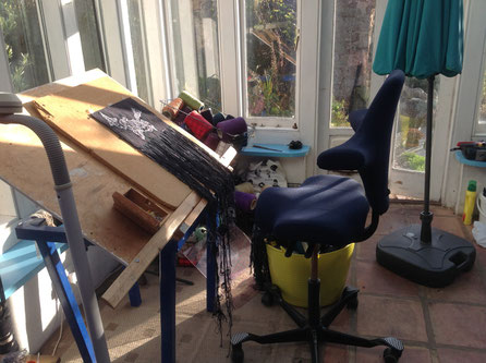
(Left: a bit of studio eye-candy)
Coming down toward the text, I don't want it to appear like sign-writing, folkloric.
How dark can I make it? I could introduce a new colour into the blended wefts, maybe quite a dark blue. Keep "night" colours, but make sure it's legible. Give it more depth than a graphic, binary colour approach. The superimposition of appropriated woodcut (flat, graphic) images on a more subtle, nuanced background is characteristic of my recent work. In this case it might help a visual transition between the tapestry on the wall and the broomstick leaning beside it.
15th November
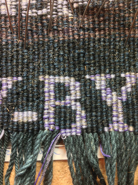
I tried the text with a dark grey, plus dull purple and royal blue strands, aiming for a bit of subtle panache. But looking at it in the morning, the blue was too much, and worked against the shadowy night-time feel I was trying for. I've replaced the blue with a strand of the medium grey from the woodcut images, to tie the colour in more with the existing palette.
17th November
The tapestry is nearly complete, and now the crucial matter of keeping the rectangular shape comes in. Given all the tensions created by knotting the different skeins of yarns of subtly different textures and weights, and splitting the wefts when creating fine detail, keeping an equilateral rectangular shape is quite challenging. Much measuring and delicate adjustment needs to be done before I reach the final commitment of the bottom edge.
20th November
I'm quite pleased with the colour balance between the images and the text. The tapestry is nearly finished, giving me time to determine how to make the composition of the installation work, before getting it photographed for the exhibition submission. i want to send a good-quality installation photo, as the elements won't be seen at their best when they're first unpacked for selection, and also to show exactly how I would prefer the work to be installed..
The bottom row of text is requiring a lot of attention and frequent measurement. Producing letters of uniform size, lying on an accurate horizontal line, requires lots of unpicking, re-knotting and minute adjustment. I can still see tiny variations, but nothing is perfect, and textile materials retain an "organic" quality and element of movement. I doubt anyone else will care very much. I've included a totally new yarn in the lettering blend, which may be the joker in the pack; it's the purple strand, and I've never tried it before. Sold by Handweavers' Studio in London, it's a cotton thread coated with latex; it has a rather "steam-punk" quality, and I'm enjoying it.
Progress is incredibly slow; but extreme attention to detail is important on a small piece like this.My big tapestries, approximately 170 cm x 170 cm, have more scope for variability and a bit of improvisation....
21st November
I am doing my utmost to get this absolutely right, spending the time needed to do whatever it takes. I've pinned, unpinned, checked and measured the cormers and final, bottom row of knotting at least six times. This is a good chance to analyse what happens with the different stresses in the individual warps and wefts.
23rd November
The end of a long day! It being late November, I'm very thankful for my daylight fluorescent lamps.
I have to say, I am quite pleased with this small tapestry.
I really like the fine surface that comes with working on single warps, and the consequent finer wefts. The smaller scale is much more practical for 62 Group submissions, and my membership has encouraged me to include this approach as part of my practice.
24th November
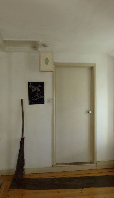
The small tapestry is now finished, and it's time to consider how it should be composed for installation. I'm moving around my house with the broomstick, looking for a suitable space of clear wall. Finding this archetypally "witchy" broomstick at a local garden centre was the inspiration for this whole idea. If I had the confidence, I'd quite like to do a video/installation/performance piece sometime, just placing the broomstick in various localities, both public and domestic, as I think it's quite a powerful signifier. Historic witch-belief still has many strands in contemporary culture, in folk memory, fairy tale, language etc, and standing a "witch's broom" in various modern contexts might be a way to convey this.
For this gallery installation, the broom could stand on the floor, or hang on the wall. I like it just standing there, referencing the everyday and domestic, but with the disruptive potential of its witchy associations; the tapestry will hang beside it to make those ideas explicit.
I'm feeling quite pleased with the piece. I think the tapestry imagery has enough vitality and movement to hold its own alongside the object, and the intensively-wrought surface gives it a presence to match that of the "real-life" broomstick.

2nd January, 2018
I took the piece and my rough snapshot to Mei Lim's studio for photographing before Christmas, and this will be the "installation" shot that I send with the work to the 62 Group submission in a couple of weeks.
Although the piece will be installed indoors in the gallery at MAC if it's selected, I like the wild, outdoor quality it has in this photo as well.
It's been a useful exercise, thinking carefully and analytically about how to combine a tapestry element with a found object. I feel that my experiment with "taking my cue" in the design of the tapestry from the starting-point of a pre-existing object has been quite successful.
Photo: Mei Lim
23rd April 2018
In the end, this piece wasn't thought to meet the criteria of the exhibition, and wasn't accepted. I'm still pleased with it, however, and will include the tapestry element, at least, in my touring solo show, "Certaine Wytches: Fear, Myth & Magic", opening at the Devon Guild of Craftsmen, Bovey Tracey, Devon, in Spring 2019.
Write a comment